In this document I'll be researching about the different types of he heroes and super heroes there are to get an idea on what my character could be like and how it could betray humility and show in overall character design. I will also be looking for research so I can have more an idea in what direction to take my character.
The main idea I have so humility is of a superhero character. For my character I had the idea of a modernised superhero but still similar to old traits that various of a superhero's have. In this document I'll be looking through the different design features super heroes have for example mask symbols and seeing how they can be incorporated into a modernised hero while also looking at modern depictions of super heroes through research. I will then at the end of this document is described my findings on what my decision will be a character design


This is an image of Judge Dredd the reason I've chose this image to examine is because of what his character means and also his character design. First off Judge Dredd is a Judge from mega city one responsible for law enforcement. Judge Dredd's main purpose is to sentence criminals and keep order through the law. His character is very determined to bring justice where ever he can. In this way he is similar to other heroes on this list as he tries to uphold the common good.
Judge Dredd uniform as well is very similar to our superhero uniform with a mask to cover is identity and very padded armour to protect him and almost certainly seems that mask is a fundamental parts of the hero's uniform


Summary:
All images came from Google and I did not own any of them
The main idea I have so humility is of a superhero character. For my character I had the idea of a modernised superhero but still similar to old traits that various of a superhero's have. In this document I'll be looking through the different design features super heroes have for example mask symbols and seeing how they can be incorporated into a modernised hero while also looking at modern depictions of super heroes through research. I will then at the end of this document is described my findings on what my decision will be a character design

This superheroes called Flash originally a DC comic Flash has almost like speed capability various superpowers. This character has a whole is based around his abilities for example the chest symbol of a lightning bolt this is the symbol for the Flash almost like the logo this is why it is also placed on various parts of the suit as well apart from the chest. As well as a logo the flash is betrayed is being almost superhuman in physical shape with bulging muscles on almost every limb this is really to show how strong he is compared to others. The final part of the suit but mask is probably the most important not only being an ascetic feature the mask is used to cover up the Flash's identity. As well as this gives the impression that the Flash could be anyone which is a common factor with superheroes this gives the illusion that anyone could be a superhero.

The Green Lantern is similar to the Flash in terms of the suits that he wears. As for example Green Lantern also has the symbol for what superhero areas across chest and also wears a mask to protect his identity. But there are still differences between the two for example the Green Lantern represents hope as the colour screen is meant to symbolise hope so most of the green light and uniform is green and even the symbol as well to reinforce that he stands a hope. Unlike the Flash Greenland has a small mask that only covers his eyes and part of his nose. While this conceals his identity shows more of his face and features allow you to see that he is more human this may be something I employ into a character line. As well as all the symbols used like the mask and chest piece the colour designs of these superhero suits seem to be of only a few colours no more than three or four for example the green light was green black and white while Flash is red and yellow this may be something to consider when creating a final idea.

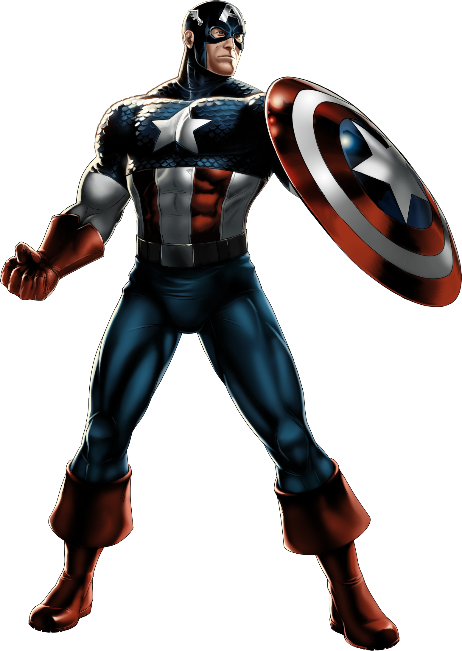
Captain America is very different to the flashing green man in the way that his entire character design is based around the country serves. Just like the American flag his suit contains blue red and white to the same colours used on the American flag also the White Star across is shielding chest. The suit aims to be similar to the flag is possible using the same colour scheme and trying to be similar to the layout of the flag using red and white stripes on the lower chest and across the shield. If I was going to create a character that may be a patriotically hero for example I may use a colour scheme like this is to show how committed the years to protecting the country. Similar to the other two superheroes Capt America wears a mask and also has a chest symbol. The mask is used to conceal his identity while the chest piece is used to show who the character is easily this is a very similar notion to the other two superheroes I've examined and seems to be a common trend within uniform design for a superhero. Differently though with Capt America is his shield this features the same star logo as well as all colours associated with his uniform as the shield is an essential part of who Capt America is it is branded with the same colours and symbols that is uniform is to show that the shield as much of a part of him as it is suit.

The character Batman is quite different to the other two super heroes in this image is a modernised depiction of Batman taken from the film the dark Knight rises. In this imagining at the suit is still remarkably similar to the other three superheroes are examined. For example the mask covers up the face and hide the identity but different about this mask is that it has ears showing obviously that's he is a bat. But unlike the heroes Batman's not have chest piece or any symbol of his bat emblem they may have on some of his weapons of the users the main way he displays a symbol is through the use of this mask. I find this quite an interesting concept as it allows the same message of symbolism to come across but in a much more subtle way compared to mass of logo across the chest. Another difference of Batman's study has a cape this is used more for intimidation and to show his association with bats which is another way he shows symbolism to what he's trying to be. The colour system with Batman suit in this modern iteration is all black without almost any hints to another, this again in forces his symbolism with bats.

Rorschach uniform and is character is very different is to the other superhero's I've examined. It is very different in the way that Rorschach looks more like an ordinarily person decides his mask. Wearing a trench coats gloves and hat your most gives off the lock that he could disguise himself in a crowd or walk-through different alleys without being recognised instantly compared to the other three. Though different from the other three superheroes by not looking so distinguishable Rorschach has a mask just like the other three. This mask is dynamic however changing depending on Rorschach's body temperature and breathing but the main feature of the mask is not to show his expressions though he's only human doesn't have any superpowers he does not want his emotions to be shown.

This is a character from the popular TV series misfits. His name is superhoodie like the other superhero as I have examined he does have similar suit designed to them will also with a few differences. For example he does use a mask to disguise his identity similar to the other superheroes. Both like Rorschach he does not have a symbol that uses he is just known for what it looks like. As for the rest of the suit as the wearer doesn't have super powers the rest of the suit is padding and honour to protect from dangers. As this type of hero is a modernised hero takes many references from society such as a hold but incorporate it with superhero design features like a mask and body armour. Similar to Batman suit in colour design it seems to only comprised of one or two colours such as grey and black thing with the modernisation of a superhero suit they now tend to focus on more dark colours to reflect the environment and time period they are in. Which means that when I am designing a character based on hero Barry will really have to look into times and dates as they seem to reflect a lot on the design of the suit.

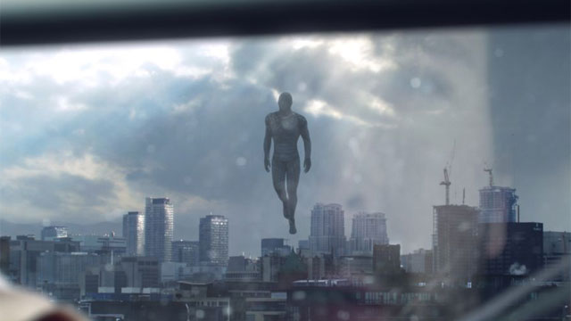
This superhero different to the others in a way that he does not wear a uniform in is more like his skin. This superhero nicknamed the flying man was shown in a short six minute film about a modern day superhero. I think that this superhero reflects out of most the list a modernised Superman having similar powers like flight and strength by having a character design similar to Rorschach or superhoodie. The superhero is shown to be in a kind of grey suit but with no distinguishable features like a face this could be similar to the mask concept seen in other superhero's. I think any is very similar to the design of superhoodie in that it is meant to be a modernised hero so it focuses on dark colours to show his influence from his background and this reinforces the idea that the environment that the hero is in does affect what they look like and how they are shown.
This is an image of a vigilantes from the game watchdogs. The reason I am looking at this image is because this character is meant to be shown as a modern vigilante. Has he is not a superhero like some of the other characters I've examined he is still similar to them in terms of what he stands for. This character shows more of a human side to a hero by showing more of his face and also with the clothing he wears similar to Rorschach and the superhoodie. As this character is meant to be set in a urban environment he has a very similar style to the superhoodie such as very dark clothing and his overall colour design is dark.

Judge Dredd uniform as well is very similar to our superhero uniform with a mask to cover is identity and very padded armour to protect him and almost certainly seems that mask is a fundamental parts of the hero's uniform
This image is of the Winter soldier from the upcoming captain America film. The Winter soldier uniform design has been changed insane ways to reflect a modern block for example the original Winter soldier had a face mask similar to sidekick of Batman and Robin. But in this re imagining he has been changed to almost a completely black outfit complete with face mask and goggles. As the Winter soldier is more of a villain still conforms to the standards superhero uniform with a mask to conceal his identity but also in this modern imagining his uniform dawns very dark colours in order to modernise him this very something I'll have to consider when designing my character.

The reason I have used this post in my research from the new captain America film is because of its new take on captain America. Compared to the comic design of red white and blue captain America knew uniform as dawned very dark colours in comparison to his previous one. But also the environment is set around in the poster is almost entirely made up of the same colour while the captain suits still has the old familiar colours they are not as present as they where in his comic imaginings. This really shows that even the most flashy colourful characters in a modern era change to their surroundings I think this will play a major role in my character development.
For the summary of the research I have done I've concluded that most superhero uniforms are defined by certain design features. For example the most important being the mask or some way to cover the face this has two main functions but it provides for the hero. The first being to conceal the identity from enemies or the public to prevent them from being discovered. In the second is to show that anyone can be under the mask and that anyone can be the hero.
With older versions of super heroes they tended to have symbols associated with them for example the star of Capt America or the Green Lantern symbol with Green Lantern. The modernised heroes tend to not have such symbols or if they do they tend to be very discreet more of like a calling card and not used on the uniform.
As for the visual design of the uniform it does have many influential factors such as purpose anaesthetics. As we saw with the superhoodie uniform that tends to be more practical use than ascetics seems that depending on the hero's abilities that dictates the suit practical use. As for statics of the suit all than heroes such as the flash tend to have more vibrant colours while modern suits tend to be more dark and use blacks and greys I think this is really to show that aired in environment of the superhero.
It is clear from the research I have done that to create a superhero they must have some kind of mask to the skies and identity. Depending on the environment to have a very limited colour scheme and it is an urban environments have very dark colours and depending on the hero's powers the suit has to function around them not just be aesthetically pleasing. As with the old superhero designs they tend to have a logo and this is how they are recognise think something like this could be incorporated into a modern hero but it would have to be done very solely for example like a badge or something of a similar size.
Another points to add seeing the modernisation of some of the heroes like captain America and also some of the modern heroes is very clear that they all reflect an urban design style of limited colours and dark undertone so I think from my final character and good trying make my character similar to this as I can.
Another points to add seeing the modernisation of some of the heroes like captain America and also some of the modern heroes is very clear that they all reflect an urban design style of limited colours and dark undertone so I think from my final character and good trying make my character similar to this as I can.
All images came from Google and I did not own any of them
No comments:
Post a Comment